


Chart on a role: Visual stunner
Last week the Financial Times published an article entitled: The Dow Jones – a flawed measure but with a rich history with the sub-heading A visual biography of the all-American average as it nears 20,000.
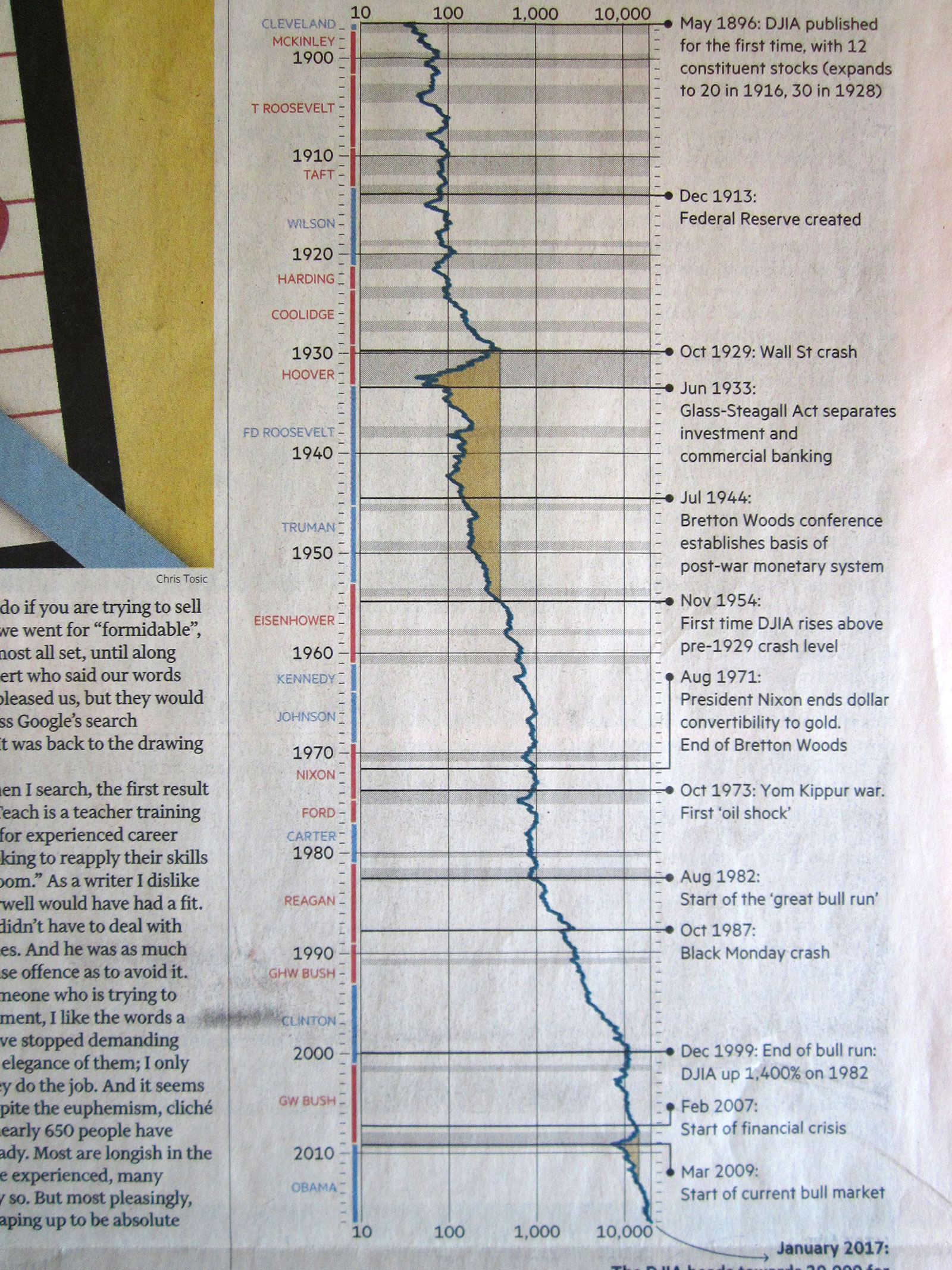
Doesn’t exactly jump off the page, does it, but before jumping to conclusions, let me say that the chart is a lot better than the text; it’s definitely one to cut out and keep. Designed by Charles Dow and Edward Jones in 1896, it originally held just 12 ‘smokestack’ stocks. Increasing to 20 in 1916 and then to its current 30 in 1928. Bloomberg today describes the index as ‘a price weighted average of 30 blue chips generally leaders in their industry’, brought about by the introduction of banks. The highest priced share currently is Goldman at $233 representing 8 per cent of the index. Next in line proper industrials 3M and IBM trading at $175 and worth 6 per cent apiece. Then Boeing and United Health with 5.5, Home Depot 4.74, and McDonald’s and Apple with 4.1 per cent and worth $120 per share. Interestingly the smallest index weighting is for a company we often think of as very big which employs hundreds of thousands of people – Wall-Mart at $67 and 2.3 per cent of the index.
The chart is laid out vertically, a bit like a Chinese scroll or the sheet a town crier might have used in the olden days. There is almost a sort of poetry about it. Note its logarithmic scale – essential for something that goes back this far. Decades marked out on the left hand axis, presidents of both colours marked clearly. Recessions are shaded in grey and for some bizarre reason periods of zero gains (1929-1954 and 2007-2012) in yellow. The format then allows space for comments and important events to be listed on the right hand side of the chart, like 1933’s Glass-Steagall Act and Nixon’s end of the US dollar peg to gold in 1971.
As for hitting the psychological and elusive 20,000 level, the question should be if, not when, as we’ve already spent six consecutive weeks trying and struggling to get there. Typical time not to hold one’s breath.
I attach a photo and a picture of the chart (which you can zoom into) but for those who have access use this link to see the chart in more detail.
![]()
Tags: Dow Industrials, history, logarithmic scale, record high
The views and opinions expressed on the STA’s blog do not necessarily represent those of the Society of Technical Analysts (the “STA”), or of any officer, director or member of the STA. The STA makes no representations as to the accuracy, completeness, or reliability of any information on the blog or found by following any link on blog, and none of the STA, STA Administrative Services or any current or past executive board members are liable for any errors, omissions, or delays in this information or any losses, injuries, or damages arising from its display or use. None of the information on the STA’s blog constitutes investment advice.


Latest Comments