


Time to tot up the year: One of the few weeks that warrants watching annual charts
Most day traders and small-time punters will groan when asked to look at a chart where each candlestick (or bar) encompasses a whole year’s worth of price action. But you see, understanding the big picture parameters are key to long term and short term tactics. Knowing where you’ve come from will give you a rough guide as to potential outcomes, the stage of a cycle you’re in, and the time it might take to reach a climax.
The other useful feature of annual charts is that it allows one to compare the performance over the last 12 months of a wide array of asset classes. Not just their progress, but it also gives you a useful gauge as to where they are relative to their long term history (assuming this is available, which is not the case for European energy and carbon markets).
Today I’m focusing on Brent crude front month futures contracts because a) they didn’t see the ridiculous negative prices which hit Nymex futures and b) I have more history. The yearly chart shows a hesitant attempt at long term trend resistance with a ‘wick/spike high’ above the line; this follows 4 years of small price moves as measured by the bodies of the candles, so 2021’s move may come as a surprise to some. The upper Bollinger band has narrowed in from very wide levels and the RSI is neutral. Not a bullish chart for Brent despite ample media coverage.
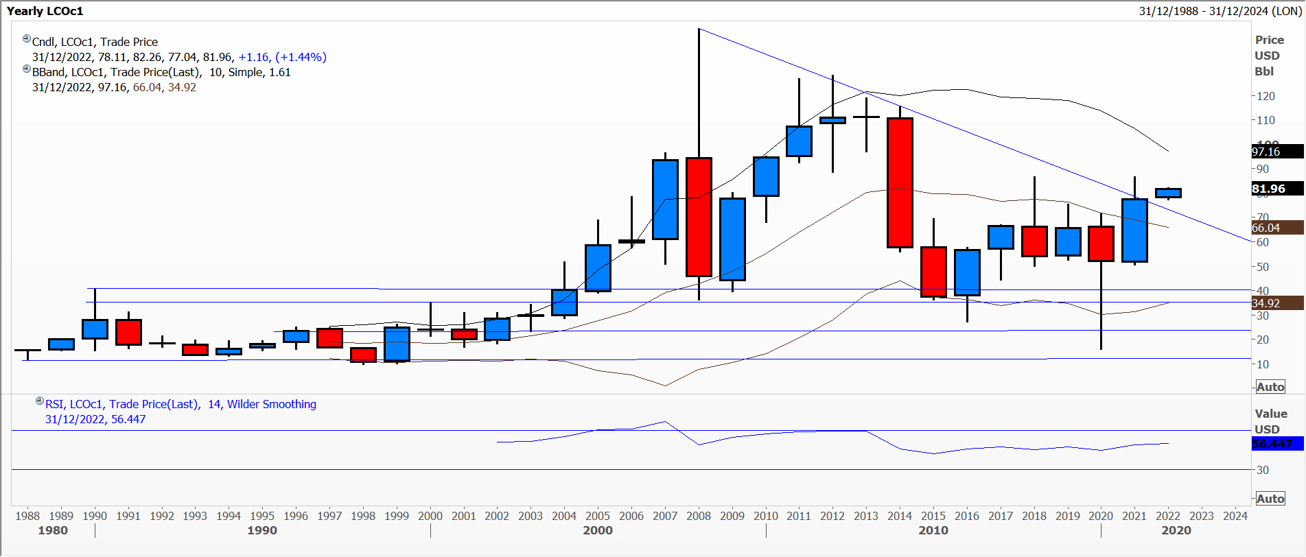
Chart 1
My second chart is a quarterly one, again showing the tussle over the last 3 quarters at trend line resistance – i.e. nearly a year’s worth of struggling despite the stop-and-reverse being bullish. Immediate trend line support is being tested, momentum is zero and the slow stochastic looks as though it might be about to turn down. Not exactly a bullish technical picture.
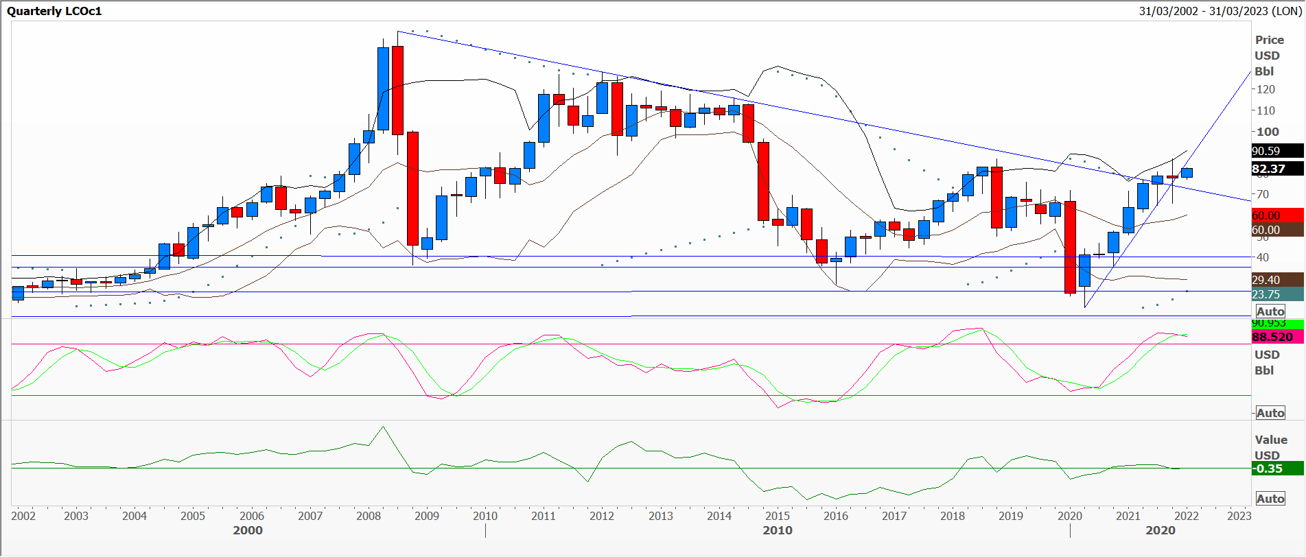
Chart 2
The monthly chart shows the battle around both trend line resistance and support over the last 6 months. The Bollinger bands have narrowed in considerably suggesting the market might be building for a breakout of the range, and the RSI is almost overbought.
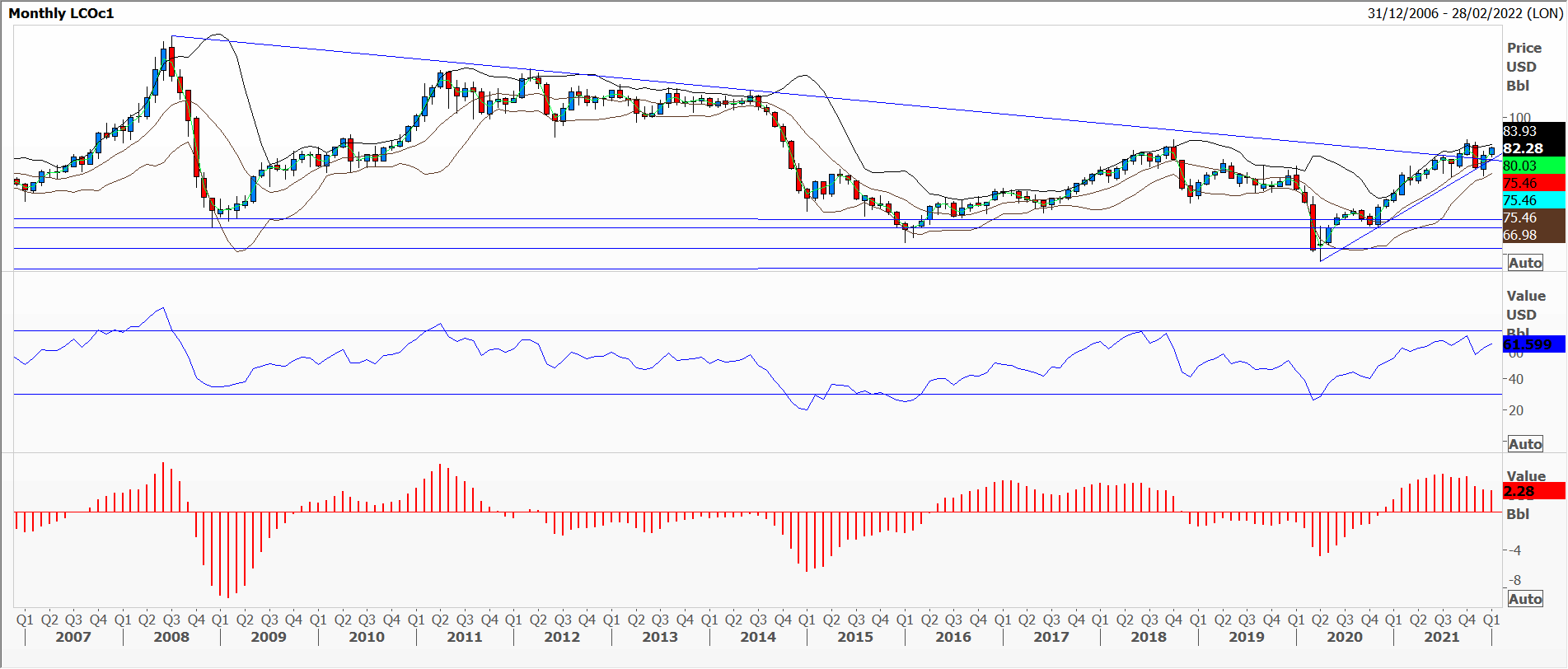
Chart 3
The most important thing is that the three time frames are backing up each other.
Tags: confirmation, Confluence, Fractals, time horizon
The views and opinions expressed on the STA’s blog do not necessarily represent those of the Society of Technical Analysts (the “STA”), or of any officer, director or member of the STA. The STA makes no representations as to the accuracy, completeness, or reliability of any information on the blog or found by following any link on blog, and none of the STA, STA Administrative Services or any current or past executive board members are liable for any errors, omissions, or delays in this information or any losses, injuries, or damages arising from its display or use. None of the information on the STA’s blog constitutes investment advice.


Latest Comments