The world’s most and least expensive cities: Where is the relative value?
Very recently the 2020 Cost of Living Report was published covering 133 cities around the globe, listing which were the most expensive to live in. Tied in top spot were Singapore, Hong Kong and Osaka, with New York in 4th place and Paris 5th. In case you’re interested, the cheapest was Damascus, Tashkent one place off the bottom, Almaty next, with Buenos Aires and Karachi tied at number 129.
For decades we’ve known that many living in Asian cities must endure cramped conditions, housing costly and the size of a rabbit hutch. Well, not exactly as planning rules stipulate a minimum amount of square metres that can be built as a domestic dwelling. But as demand has outstripped supply for years, standards have been eased and the smallest a UK studio flat can be is 30 square metres; in other countries this drops as low as 20 square metres.
FT Weekend 2-3 May 2020 ran a piece about the ‘tiny house’. An enterprising young carpenter in Bristol built his first little house – 2.4 metres wide, 5 metres long and 4.5 metres tall (‘for a log cabin vibe’, he says) – costing a grand total of £6,000. Readymade ‘turnkey’ versions are currently available in the US, their popularity rising since 2008’s financial crisis.
What’s this got to do with technical analysis you ask. It’s because here too, size matters – and we’ve seen some whopping moves in financial markets so far this year. We’ve perhaps also been lulled into a false sense of security by small steady moves in one direction only, and are therefore found ourselves unprepared for an abrupt change in tone.
Chart trends, patterns and candlesticks also have rules regarding their proportions, position in the bigger picture, and potential impact. A Marabuzo candle must be taller than each of the three black crows. A breakout from a symmetrical triangle should occur two thirds into its apex. A head & shoulders top should occur after a decent uptrend.
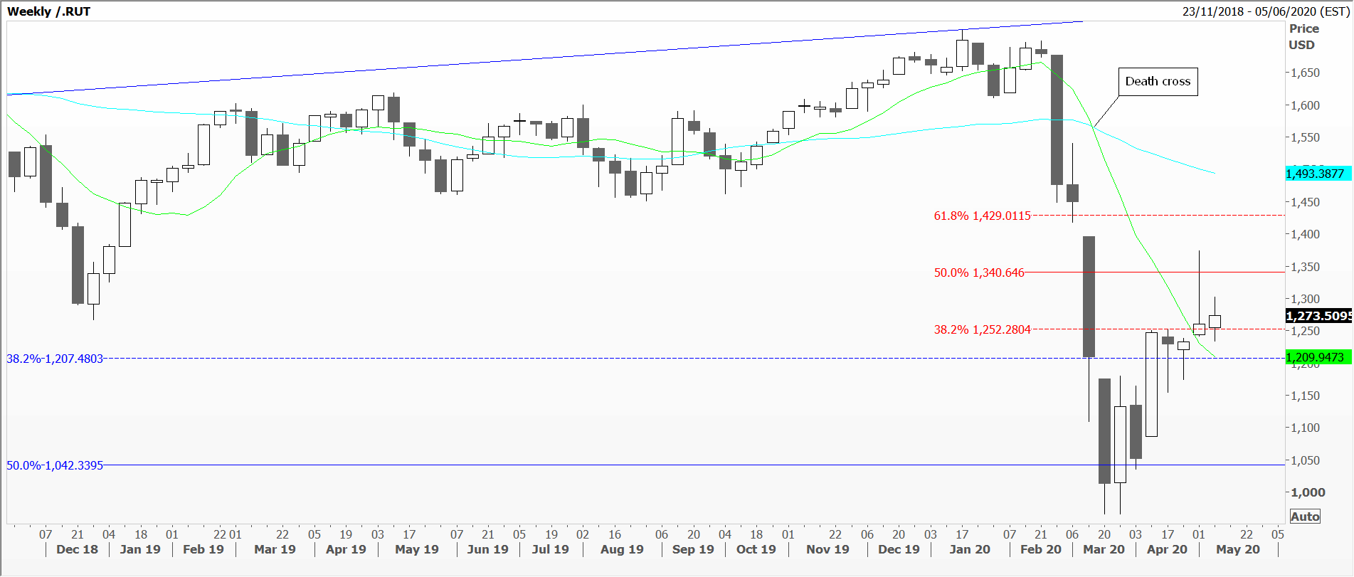
The trouble is, what happens before said events creates a background that can distort our vision. My first chart is a weekly one of the Russell 2000 index, where a year’s worth of small weekly moves, and uninspiring 50 and 200-day moving averages, gave investors no forewarning of what was coming in Q1 2020.
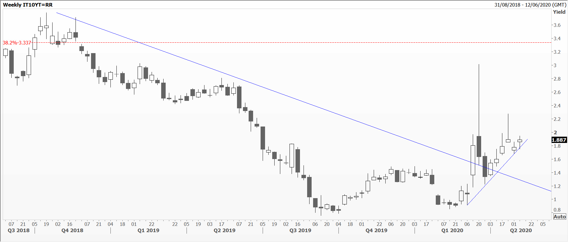
Similarly my second chart, the weekly yield on a 10-year Italian government bond (BTP), which had hovered close to a record low at about 1 per cent since Q3 2019. The back-up in March came with a bite, and one which Italians might have to grapple with for months – if not years.
Hopefully you’ll be able to read the article in full via this link.
Tags: Drama, Proportion, Size
The views and opinions expressed on the STA’s blog do not necessarily represent those of the Society of Technical Analysts (the “STA”), or of any officer, director or member of the STA. The STA makes no representations as to the accuracy, completeness, or reliability of any information on the blog or found by following any link on blog, and none of the STA, STA Administrative Services or any current or past executive board members are liable for any errors, omissions, or delays in this information or any losses, injuries, or damages arising from its display or use. None of the information on the STA’s blog constitutes investment advice.
Latest Posts
- Why Your Post-Nominals Matter: MSTA & FTSA July 3, 2025
- How I Used Dow Theory to Strengthen My Market Convictions June 20, 2025
- The New Monetary Order: Russell Napier on Inflation, Debt, and Financial Repression June 12, 2025
- Why I Became (and remain) a Member of the STA May 29, 2025
- The Emotional Rollercoaster of Markets: Why Bubbles Repeat and How to Outsmart Them: Summary of Kim Cramer Larsson talk May 14, 2025


Latest Comments