


Maximising moving averages with histograms
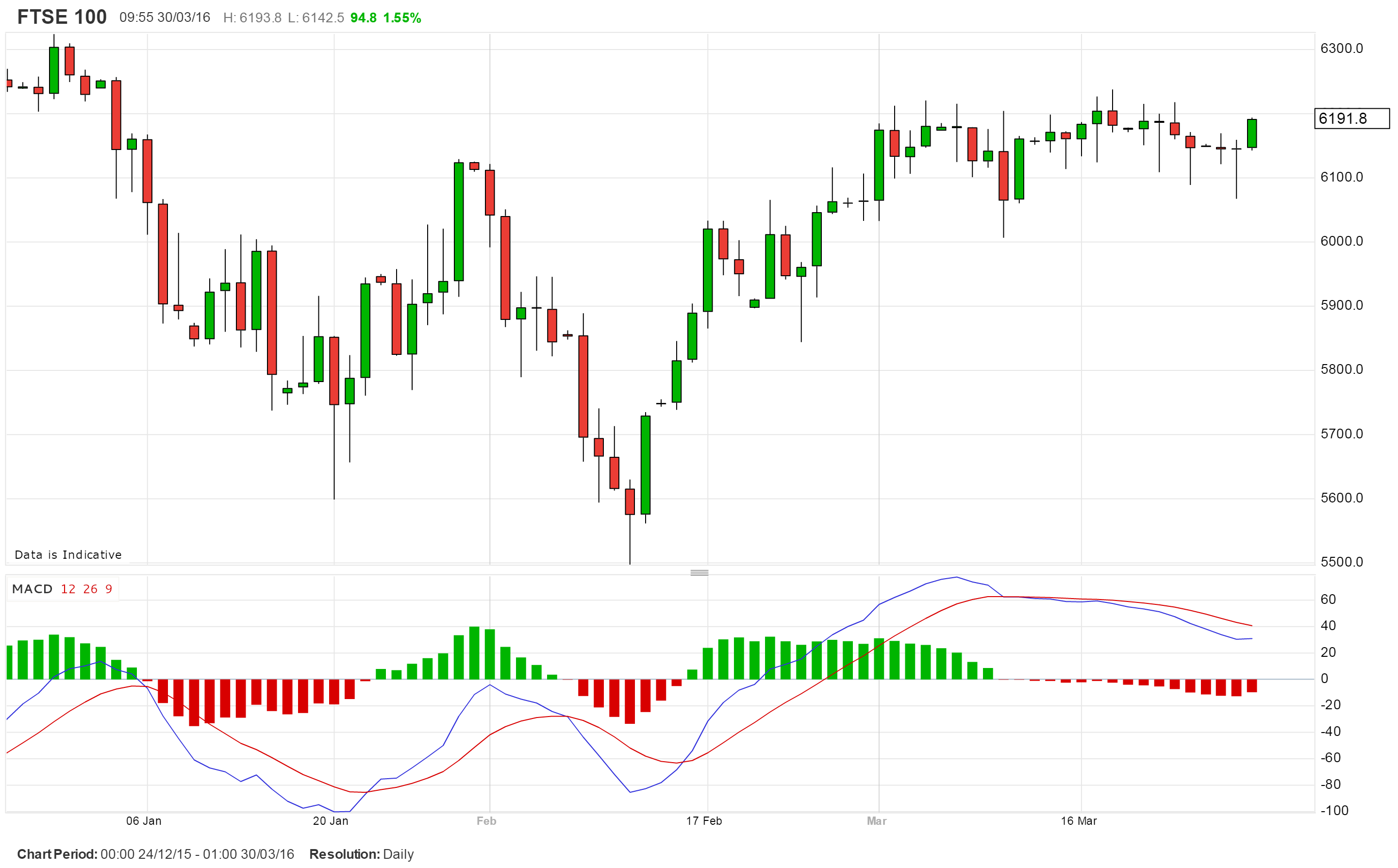
Loved by the trading community and developed by Gerald Appel about forty years ago the Moving Average Convergence/Divergence (MACD as it’s usually known) aims to drill down into trends – and when they begin to lose momentum. Calculated by subtracting the 26 day exponential moving average from its shorter 12 day counterpart, a Signal line is generated by the 9 day EMA of the result. Both lines are plotted below the chart, as is the case with nearly all oscillators, above zero in a bull market and below it when bearish. Interestingly both 9 and 26 day moving averages (of the day’s midpoint) are used in Ichimoku cloud charts.
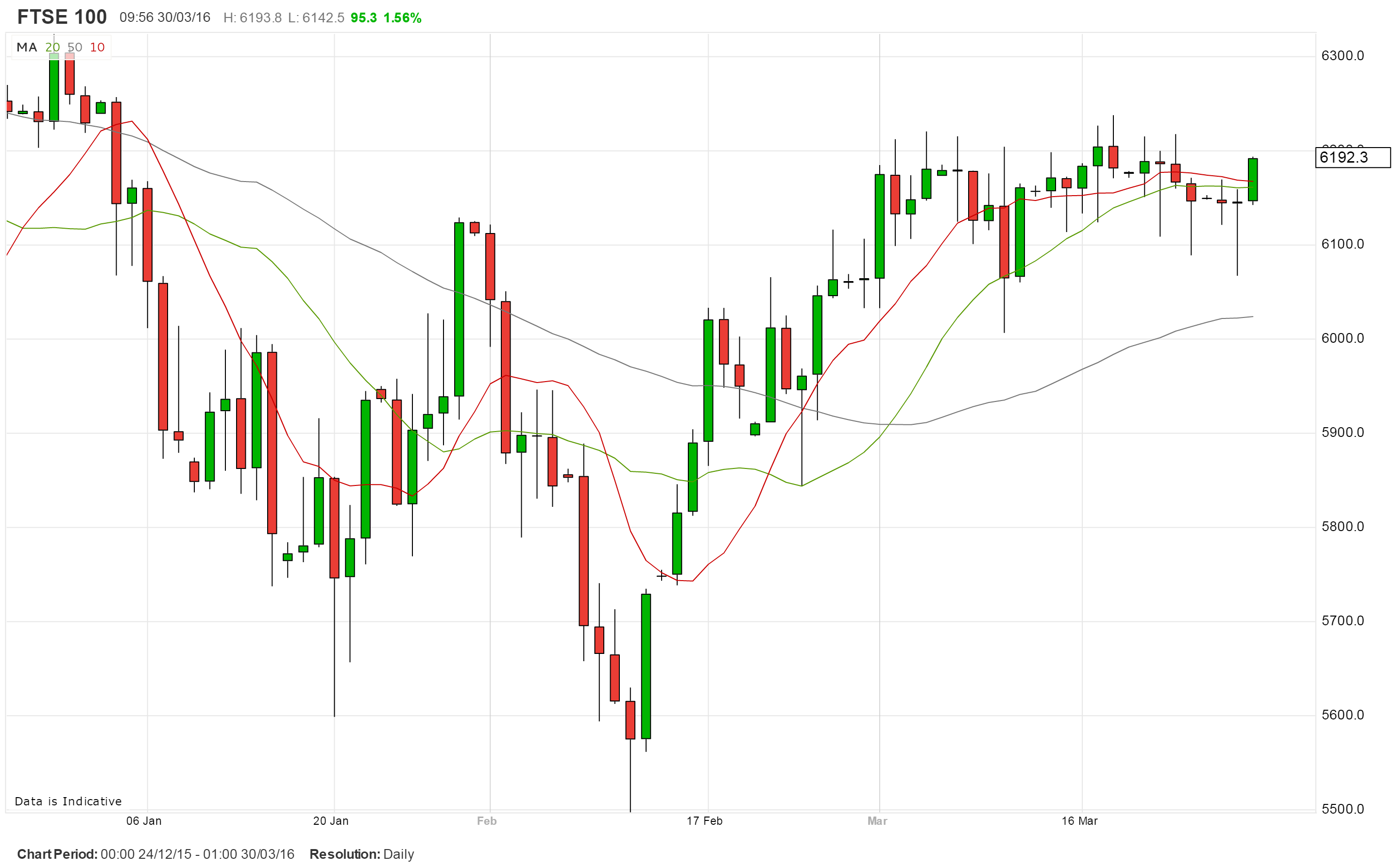
Buy and sell signals are generated when the MACD’s two lines cross, added weight being given when these push through the zero line; this combination is a good way to tailor the size of one’s trading positions. The only trouble is that sometimes the lines hug each other closely, as has been the case recently in the FTSE 100 index. One way of overcoming this small problem is to plot the difference between the two lines as a histogram – green when bullish and red when pointing south as is the case with this data vendor.
On the histogram one can also quickly spot whether a trend is accelerating, in that the differential widens, of if it’s losing steam as we move towards the zero line. I find this method visually superior.
In theory one could also plot any pair of moving averages in this way – yet we never do. They are both plotted as lines overlaid on the underlying price chart, a convention vigorously adhered to. One explanation is that some analysts use the moving averages themselves as support and resistance levels.
A variation on a histogram is the Detrended Price Oscillator. Designed to spot cycles rather than trends, it uses a simple 20 day moving average which is displaced 11 days to the left (back in time unlike the cloud which is pushed forward). For this reason it tends to match actual price moves more closely. One then plots the distance between this line and the current price. The DPO cycle for FTSE 100 suggests it’s roughly six weeks long so far this year. Again, it has the clarity of the histogram.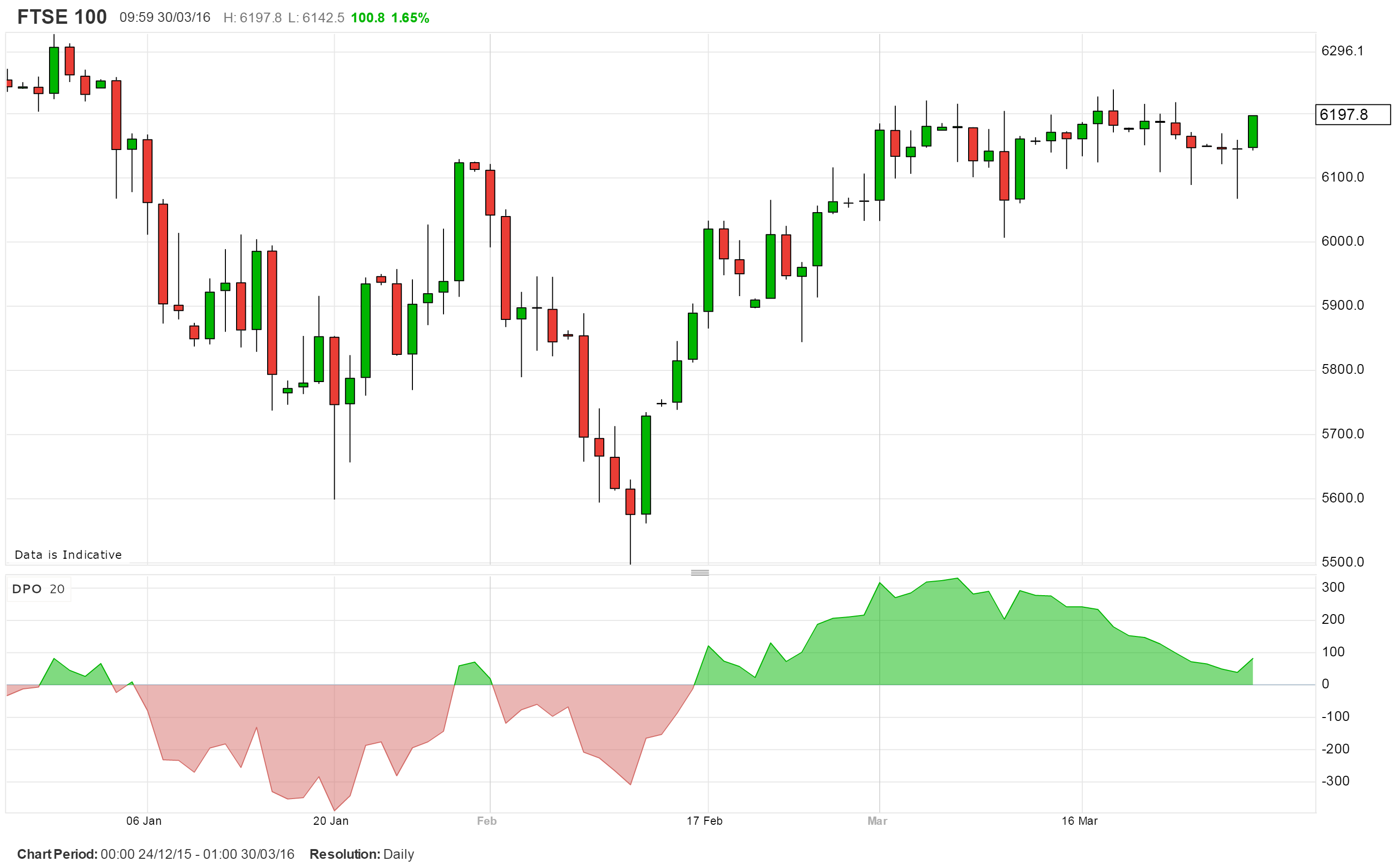
Tags: DPO, histogram, MACD, moving averages
The views and opinions expressed on the STA’s blog do not necessarily represent those of the Society of Technical Analysts (the “STA”), or of any officer, director or member of the STA. The STA makes no representations as to the accuracy, completeness, or reliability of any information on the blog or found by following any link on blog, and none of the STA, STA Administrative Services or any current or past executive board members are liable for any errors, omissions, or delays in this information or any losses, injuries, or damages arising from its display or use. None of the information on the STA’s blog constitutes investment advice.


Latest Comments