


When is an island not an island? A: No, the answer isn’t Brexit Britain
With lockdown being de rigueur this season, and all the talk of family bubbles, travel corridors, quarantining and social isolation, I happened to spot a few potential island reversals in the charts. Which then set me thinking about their validity, considering the other idea that gaps should be filled.
The clearest potential island is on the daily candlestick chart of the Dow Jones Industrial Average. Gapping up a lot on the 5th June, it then hovered in a small range for another three days, only to gap down on the 11th with a large black Marabuzo candle. Interestingly, all of the above happened around the 200-day moving average which, despite the rally since March’s low, shows no signs of turning up – yet.
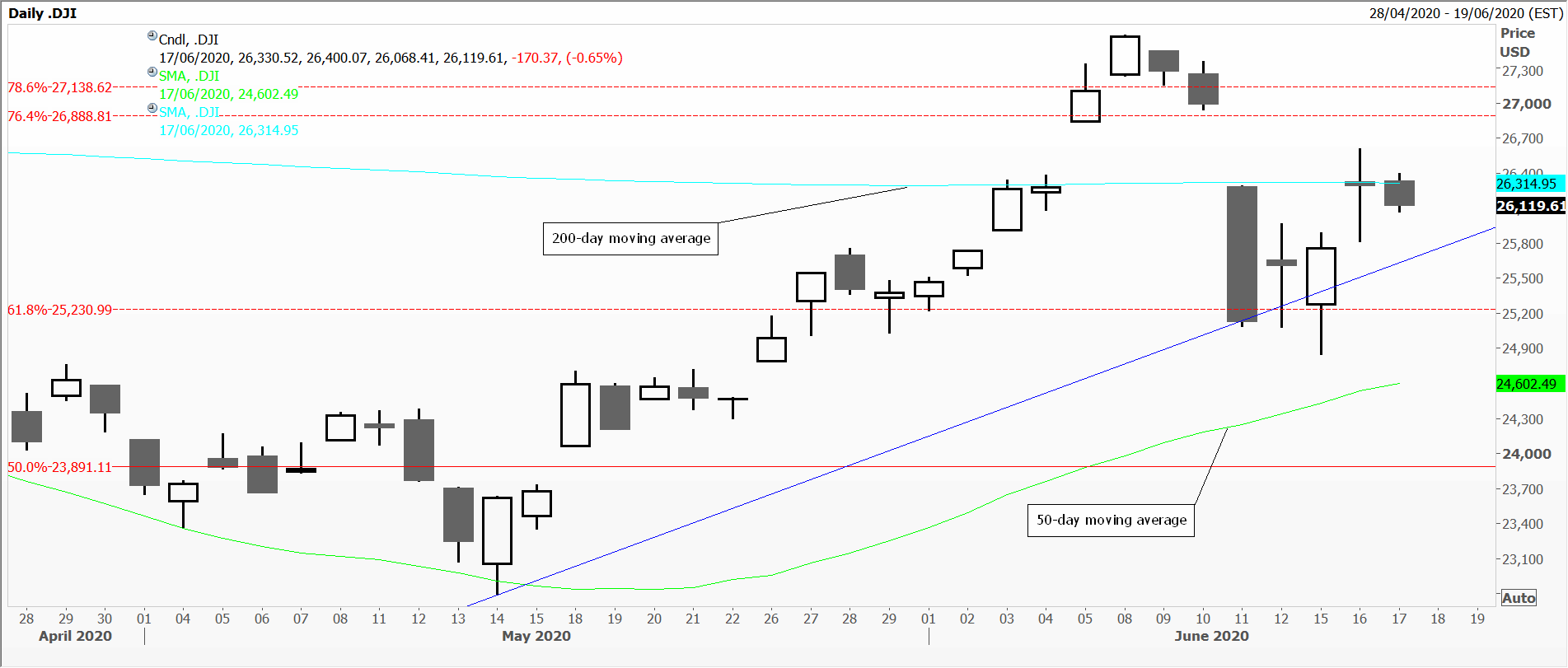
Dow Jones
The next chart is of the US Russell 2000 index, a far broader index than the Industrials, and also a laggard in terms of the size of the bounce it’s managed since March. Here the gaps are so tiny they’re hard to spot at all, but also happen just under the 200-day moving average and above the Fibonacci 61 per cent retracement resistance level taken from this year’s high. What we’ve got looks increasingly like consolidation between the 50 and 200-day moving averages.
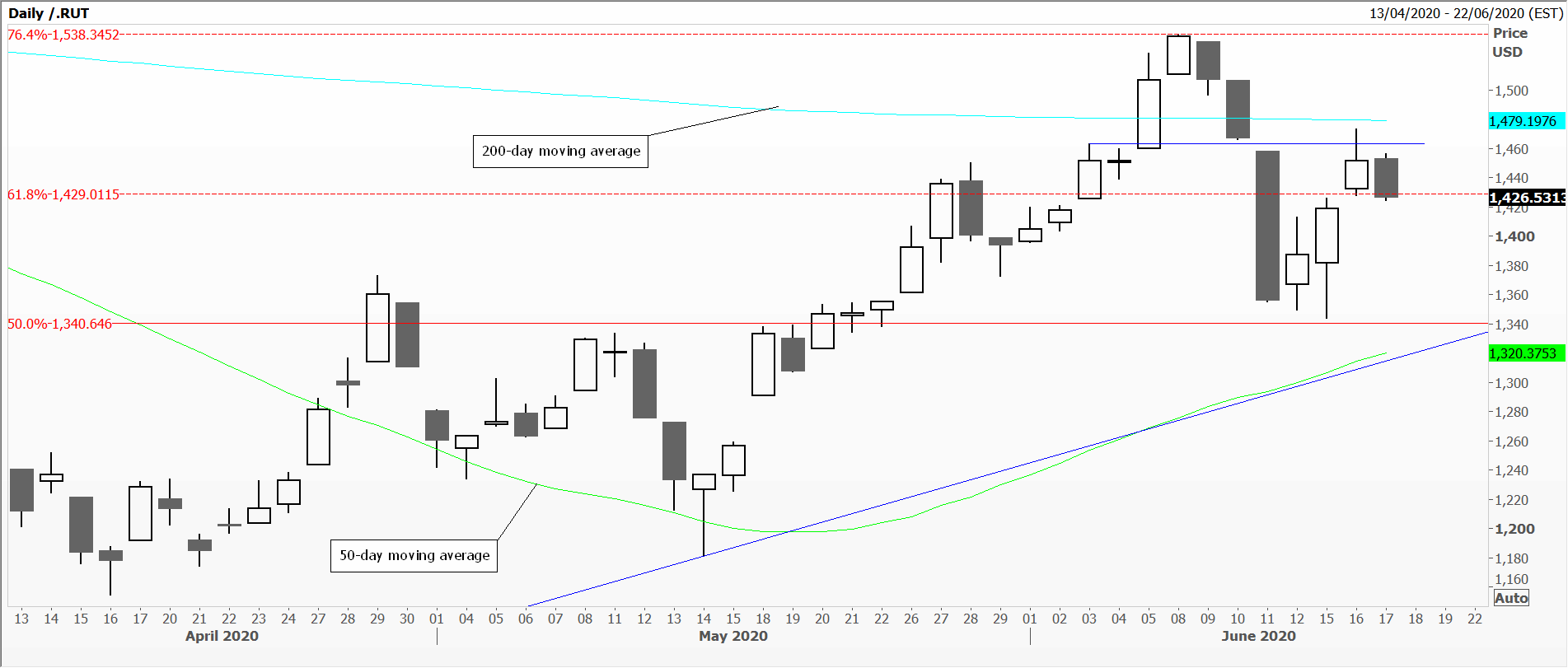
Russell
Finally the UK’s FTSE 100 index. These are prices from the London Stock Exchange where the opening calculation starts at the previous closing level, and then, as shares which make up the index trade, create the changes in the index; therefore, this one never gaps. Also remember that many brokers supply charts which use their own prices. These are labelled FTSE 100 because the LSE believes that any form of product dissemination is good for business. On the other hand, other exchanges and index providers like Standard & Poor’s, don’t allow this, so they call it by another name making, it clearer that these are not ‘official’ traded prices.
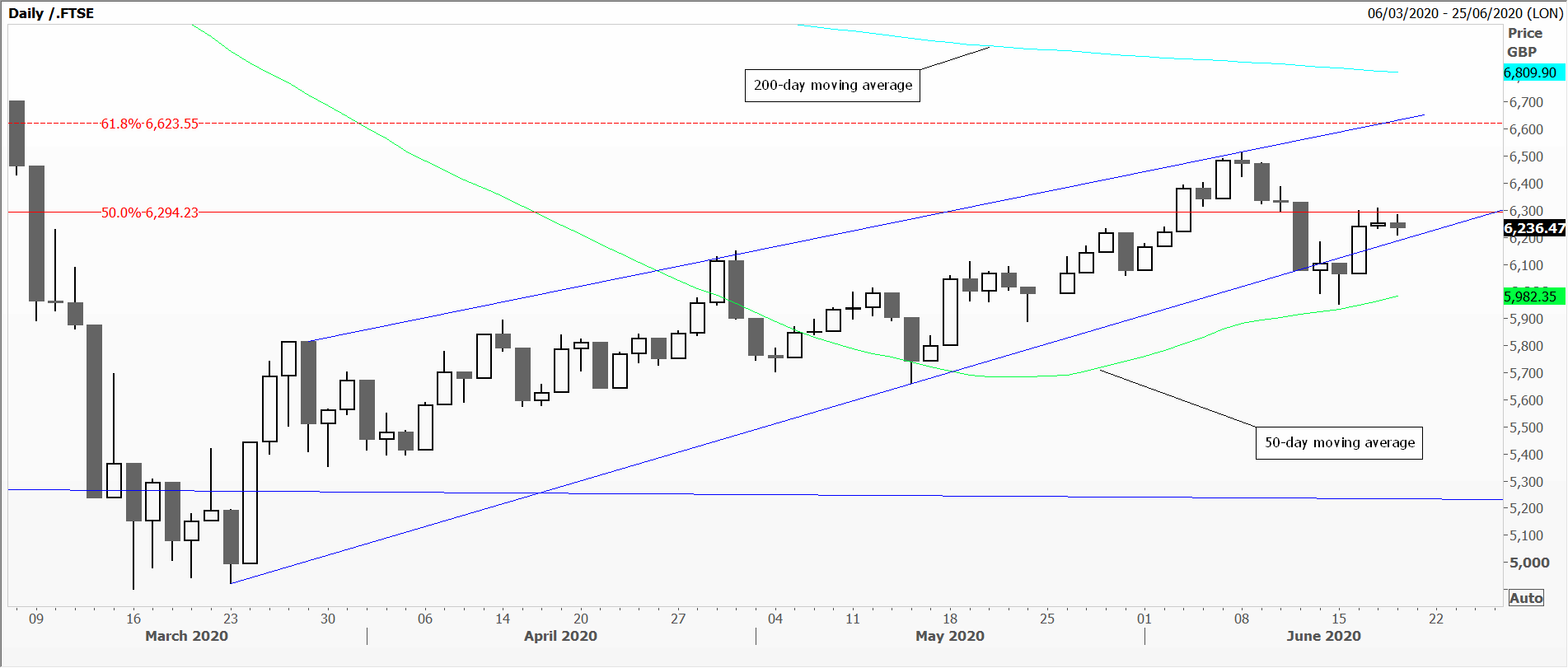
FTSE
The FTSE 100 chart, unsurprisingly, looks much like the other two, hovering between the two long term moving averages, just under the Fibonacci 61 per cent retracement resistance, in what looks like a wedge – or even flag formation – using this year’s high and March’s low. No island at all.
Tags: Fibonacci Retracements, gaps, Island Reversals, moving averages
The views and opinions expressed on the STA’s blog do not necessarily represent those of the Society of Technical Analysts (the “STA”), or of any officer, director or member of the STA. The STA makes no representations as to the accuracy, completeness, or reliability of any information on the blog or found by following any link on blog, and none of the STA, STA Administrative Services or any current or past executive board members are liable for any errors, omissions, or delays in this information or any losses, injuries, or damages arising from its display or use. None of the information on the STA’s blog constitutes investment advice.


Latest Comments