


Fractals in markets: How to spot them
According to Wikipedia: A fractal is a natural phenomenon or a mathematical set that exhibits a repeating pattern that displays at every scale. If the replication is exactly the same at every scale, it is called a self-similar pattern. An example of this is the Menger Sponge. Fractals can also be nearly the same at different levels. This latter pattern is illustrated in the magnifications of the Mandelbrot set. Fractals also include the idea of a detailed pattern that repeats itself. In layman’s terms, it’s like broccoli or the branches of a tree, where each and every smaller part looks similar to the organism as a whole.
I find that often when charting the markets these too can be subdivided into smaller patterns of themselves and are of similar appearance. Think of it as a sort of central tendency which repeats itself in larger format over longer time frames. Look at the examples of spot gold, starting with the chart using 4-hourly candles, going up to weekly and then monthly ones. I think you will agree that it tends to consolidate in triangle formations. Not necessarily symmetrical ones – a few right-angled ones are dotted around – which span very short to ultra-long periods. Worth also noting just how often these do not ‘work’; they suffer from false breaks and failure to meet targets. This also is worth remembering the next time you decide on a strategy.
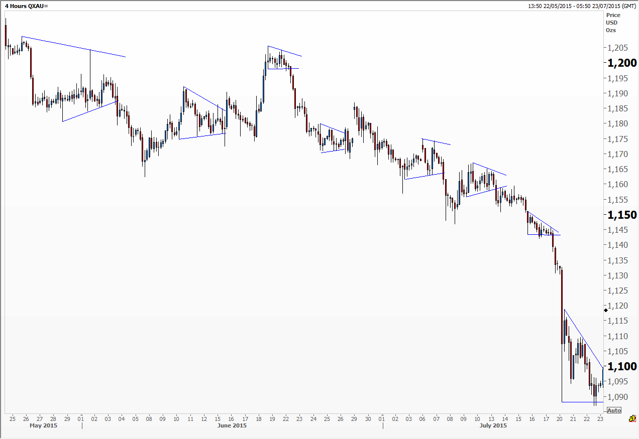
Gold 4hr
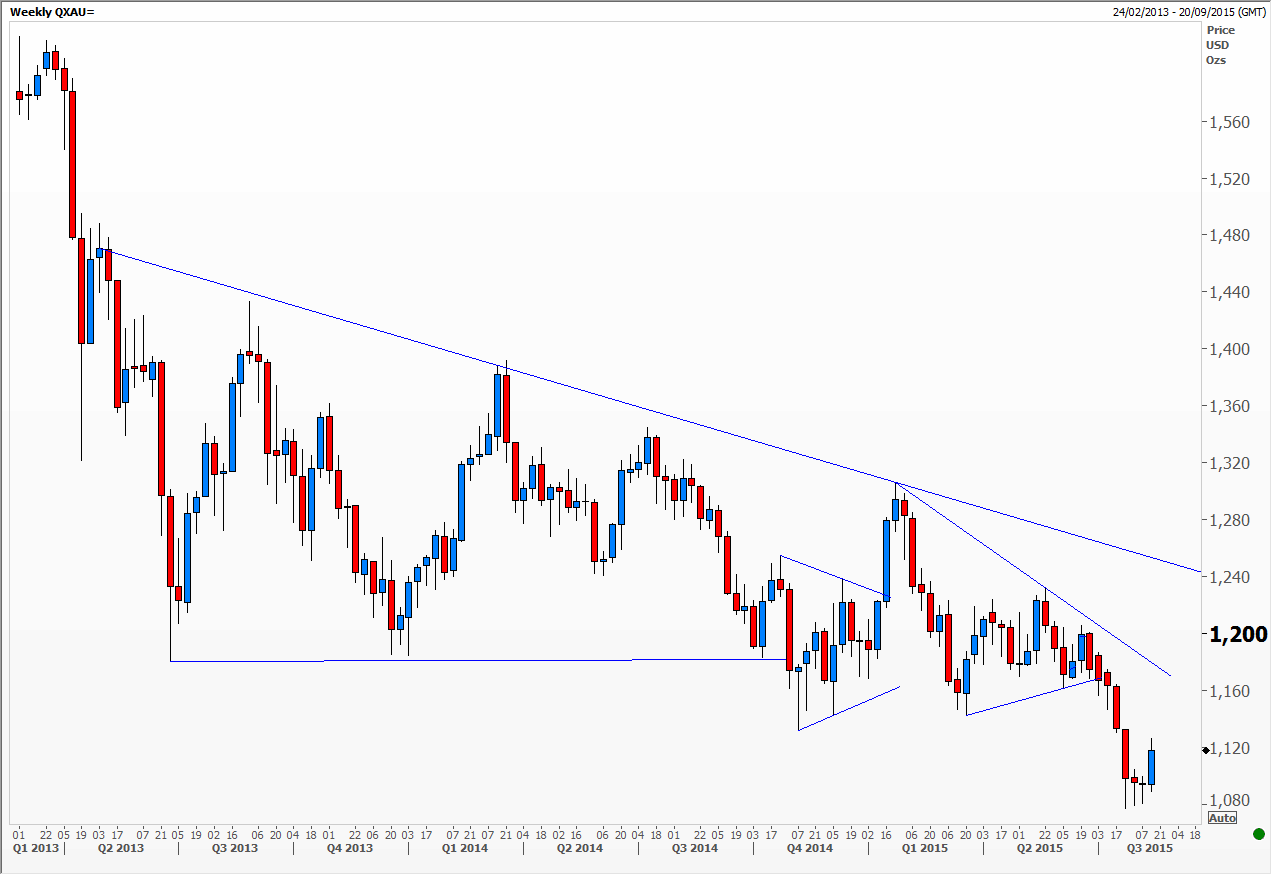
Gold wkly
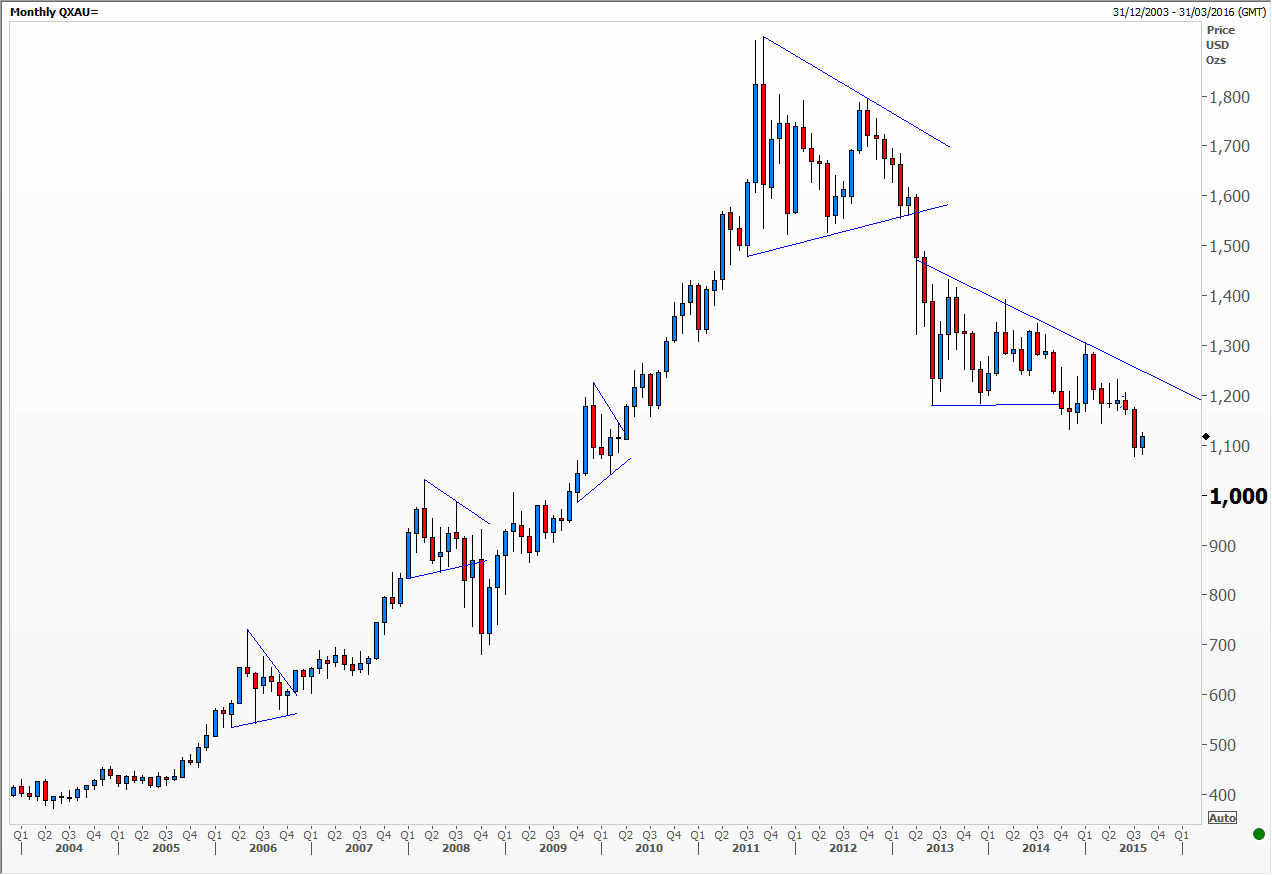
Gold mth
Now look at the charts of Malaysia’s main share index traded on the Kuala Lumpur stock exchange. The weekly chart shows how since Q4 2013 a slightly irregular head and shoulders top formed. The first break of the neckline saw prices plunge to meet the 100 per cent measured target at 1,675. The subsequent massive rally forms the right shoulder of a larger head and shoulders pattern that started in Q2 2013. This week saw a break below the bigger neckline and prices slumped to the 161 per cent measured target of the smaller pattern. Interesting to see how these are currently working in tandem with each other. Note that we formed a similar chart pattern in 2007/2008 (see the monthly chart) with long spikes down to the neckline.
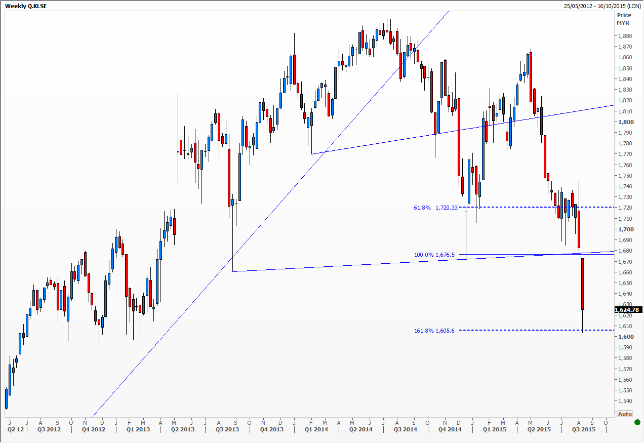
KLSE wkly
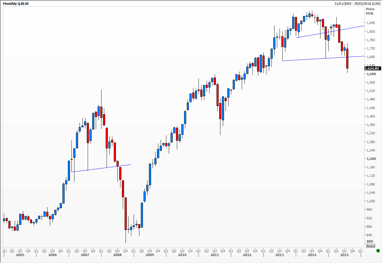
KLSE mth
Charts from Thomson Reuters
Tags: gold, Malaysia, stock indices
The views and opinions expressed on the STA’s blog do not necessarily represent those of the Society of Technical Analysts (the “STA”), or of any officer, director or member of the STA. The STA makes no representations as to the accuracy, completeness, or reliability of any information on the blog or found by following any link on blog, and none of the STA, STA Administrative Services or any current or past executive board members are liable for any errors, omissions, or delays in this information or any losses, injuries, or damages arising from its display or use. None of the information on the STA’s blog constitutes investment advice.


Latest Comments